Mobile traffic accounts for the vast majority of global web interactions, yet most businesses still design for desktop first and treat mobile as an afterthought. If a user clicks your link and stares at a blank screen for more than two seconds, they are gone. High mobile bounce rates do not just hurt your ego; they directly bleed your revenue and destroy your search engine rankings.
Fixing this requires more than just making a website “responsive.” In 2026, eliminating mobile bounce rates demands a fundamental shift in WordPress architecture, focusing heavily on technical performance, asset delivery, and frictionless user experience (UX).
1. True Mobile-First: Conditional Asset Loading
One of the biggest mistakes in standard WordPress development is forcing mobile devices to download desktop-heavy assets. Pre-made, bloated themes load massive JavaScript libraries, complex sliders, and high-resolution background videos across all devices, instantly killing mobile performance.
A custom WordPress architecture utilizes conditional loading. This means the server detects the user’s device and strictly delivers only the code necessary for that screen size. By stripping out heavy animations and deferring non-essential JavaScript until after the initial paint, you drastically reduce the Document Object Model (DOM) size, resulting in instant rendering on cellular networks.
2. Conquering Cumulative Layout Shift (CLS)
Nothing frustrates a mobile user more than attempting to click a button, only for the page to suddenly shift, causing them to click an ad or the wrong link. This is known as Cumulative Layout Shift (CLS), and Google severely penalizes websites that fail this Core Web Vital.
To eliminate CLS on WordPress, developers must:
- Explicitly declare width and height dimensions for all images and media so the browser can reserve space before the image loads.
- Avoid injecting dynamic content (like pop-ups or heavy ad banners) above existing content without user interaction.
- Preload custom fonts to prevent the dreaded “Flash of Unstyled Text” (FOUT) that shifts layouts during the loading phase.
3. Conversion-Centered UI: The “Thumb Zone”
Technical speed is useless if the interface is impossible to navigate. A massive factor in mobile bounce rates is poor usability. Users do not use a mouse on mobile; they use their thumbs.
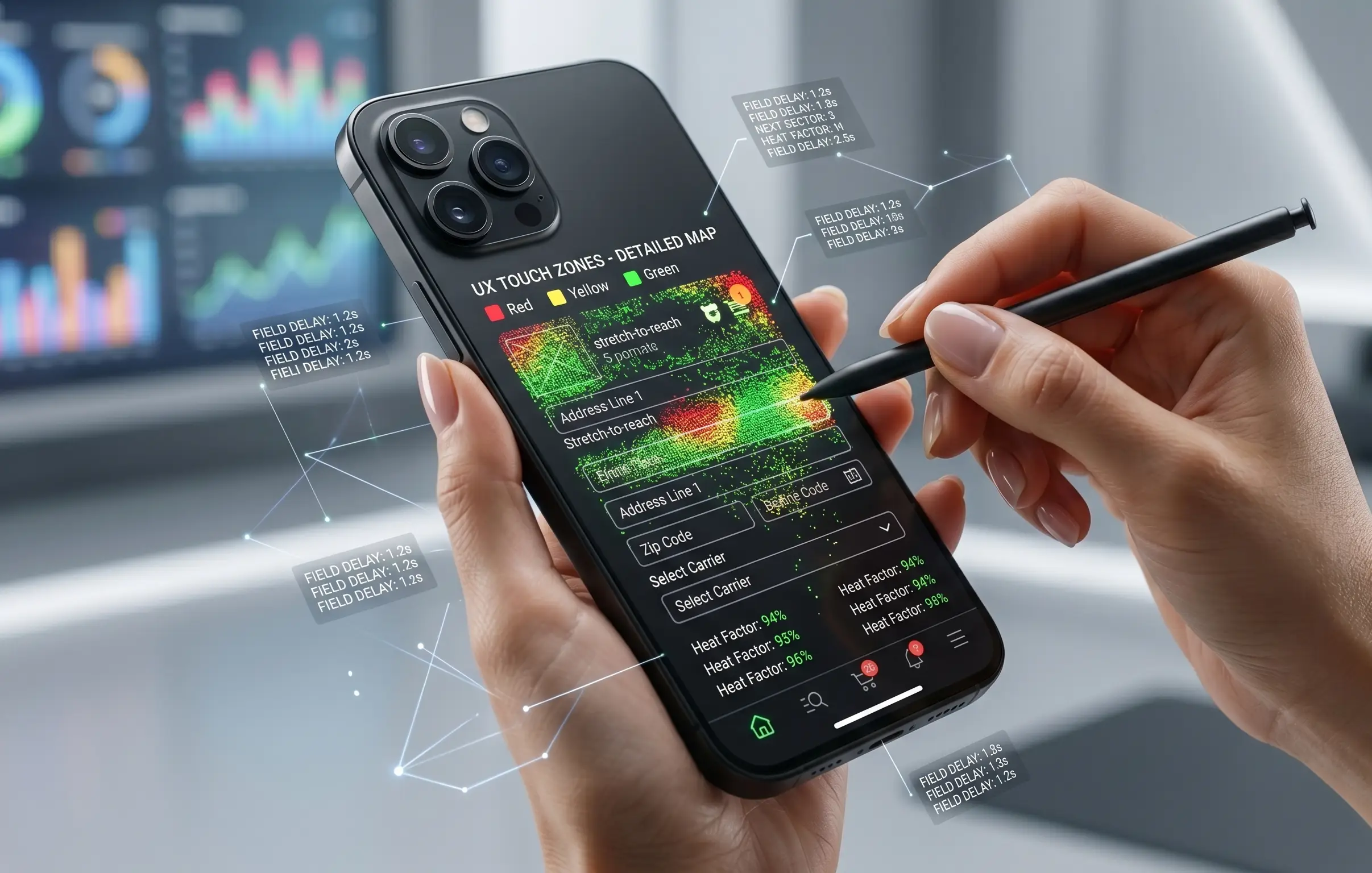
High-converting mobile design maps crucial interactions to the lower half of the screen. Critical elements like your primary Call-to-Action (CTA), WooCommerce “Add to Cart” buttons, and navigation menus should be effortlessly accessible without forcing the user to stretch. Furthermore, increasing the spacing between touch targets prevents accidental clicks, entirely removing friction from the user journey.
4. Edge Caching and Next-Gen Media Delivery
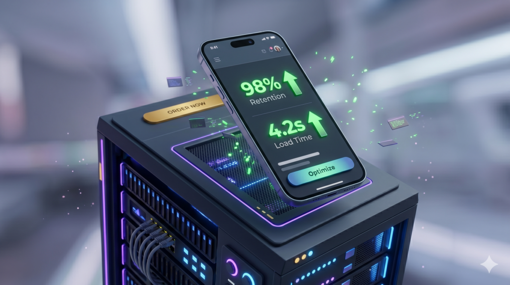
Mobile users are often on unstable 4G or 5G connections. To guarantee sub-2-second load times regardless of their network status, your WordPress site must leverage robust server-side caching and a global Content Delivery Network (CDN).
Serving images in next-gen formats like WebP or AVIF reduces file sizes by up to 70% without losing quality. Pairing this with Edge caching—where a static version of your site is stored on servers physically closest to the user—ensures that your site loads instantly, effectively neutralizing bounce rates before they can occur.
Conclusion: Speed is Your Best Salesperson
Mobile bounce rates are not a mystery; they are a direct symptom of poor technical architecture and neglected UX. By shifting away from heavy themes and investing in custom, performance-optimized WordPress development, you secure your traffic and exponentially increase your lead generation.
Is your mobile site losing you money? Stop guessing. Let our technical team engineer a custom, high-speed digital experience that turns mobile clicks into guaranteed revenue.